
Difference: RevisedWebsiteDesign (8 vs. 9)
Revision 92010-04-26 - AndyLawrence
IVOA website redesignThe Exec has decided to make the IVOA website more friendly for people in search of information regarding Virtual Observatory technology and tools. The conceptual design is embedded in this IVOA Note. This twiki page provides links to evolving drafts of the new web pages, and a continuing opportunity for community comment.Links to draft material | ||||||||
| Changed: | ||||||||
| < < | Basic concepts are baseline design are as in the IVOA Note | |||||||
| > > |
| |||||||
| Changed: | ||||||||
| < < |
| |||||||
| > > |
| |||||||
| Added: | ||||||||
| > > |
| |||||||
| Changed: | ||||||||
| < < | Comments on drafts | |||||||
| > > | Comments on current draft | |||||||
| Deleted: | ||||||||
| < < | Link to current draft : | |||||||
Place your comments here :
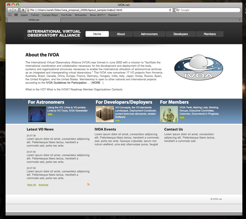
Comments on Conceptual Design Version 20100301The w3c pages have four top categories - standards, participate, membership, about. These seem relevant to the IVOA - especially the standards (http://www.w3.org/standards/) and participate sections (http://www.w3.org/participate/) If the IVOA site followed a similar model - the links to the VO projects (for astronomer consumption) would then be found in the 'about' section. The layout suggested in the figure above looks nice - but the prominence given to 'For Astronomers' will mislead. Those who stumble upon the ivoa.net site will see that - think this is a VO - and be confused with what they find there - i.e. something that isn't a VO service for them. In general - most organisations give highest web prominence to their main product targeted at their main stakeholder. Thus for the ivoa - surely this is standards for deployers/developers. Thus I'd suggest a layout with 'standards, participate, membership, about' as the main sections. -- NicholasWalton - 01 Mar 2010 Nic - point taken, but for right or wrong, IVOA Exec has concluded pretty firmly over last year or two that it has a direct user-facing responsibility, because lots of people have heard of IVOA. A worse mistake could be if astronomers find the site, assuming its where they find out about the VO, and then find nothing but techy jargon, which will put them off the VO. So there must be a bit for them; but I do agree personally that they are not the main audience. So perhaps the solution is to move the Astro block to the right rather than left which looks "first". Or maybe label these sections "Information for Astronomers" etc rather than just "For Astronomers".Comments on Conceptual Design Version 0.5Following initial debate at the Exec meeting of November 2009, the general guidelines for the redesign were set out in this note, which was brought to the attention of the IVOA community. Suggestions were received as follows :
<--
| ||||||||
View topic | History: r23 < r22 < r21 < r20 | More topic actions...
Ideas, requests, problems regarding TWiki? Send feedback